
You’ve seen the HubSpot Marketplace. It’s packed with "ready-to-go" themes that look incredible in the demos. They have high-end photography, smooth layouts, and promise a "launch in minutes" experience. You buy one, swap in your logo, and wait for the leads to flood in.
But then, reality hits. Your site feels generic. Your brand doesn’t quite fit the boxes. Worse, your marketing team is constantly begging for "one small tweak" that turns into a week-long headache because the theme wasn't built for your specific needs.
If your HubSpot site feels like a clunky anchor rather than a growth engine, you aren't alone. Here is why your current setup is probably broken and how to turn it around.
1. The "Pretty Theme" Trap
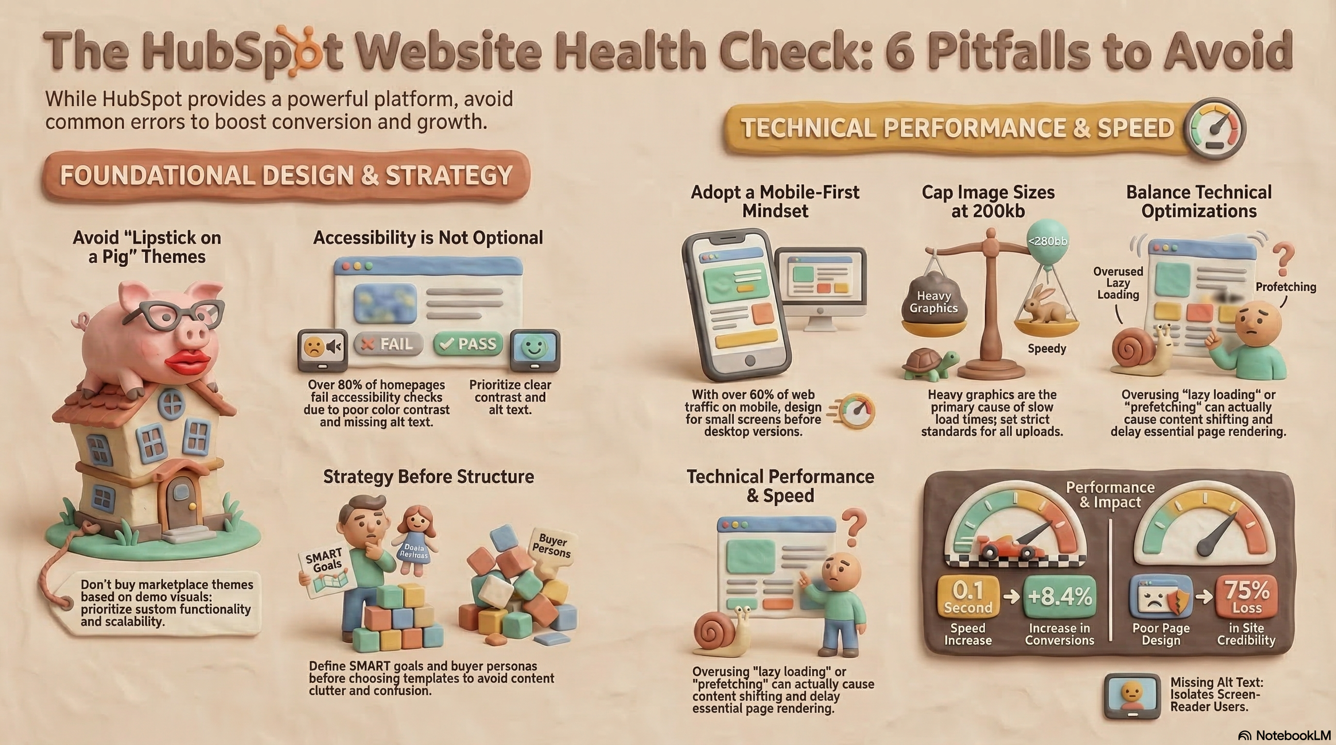
Here’s the deal: buying a marketplace theme based on how the demo looks is the fastest way to regret your website investment. Theme developers fill those layouts with professional assets to make them look exciting. But once you start trying to make it work for your business, you realize that all that flash is just lipstick on a pig.
You’re paying for a rigid tool that looks good but doesn’t actually function. Here are the biggest risks:
- Your Brand Gets Diluted: Themes are built to work for everyone, which usually means they work for no one. If you have a unique aesthetic or want custom animations, a pre-made theme will fight you every step of the way.
- The "Abandonment" Risk: Marketplace developers often have no incentive to help you once they have your money. Many are unresponsive when things break, and some even hold copyrights that legally prevent you from making the deep edits you need.
- The Intentional Upsell: Many developers intentionally leave out advanced features—like dynamic content—hoping you’ll get frustrated and pay them for custom consulting hours later.
- Scaling Walls: Most cheap themes are built for single landing pages, not a growing brand. As you add more content and complexity, the structure will crumble.
2. The Knowledge Base Mess
Your Resource Center or Knowledge Base (KB) should be the headquarters for your customers’ journey. Instead, most companies turn theirs into a disorganized junk drawer.
Don't just slap on a category filter and call it a day. That doesn’t help your user. You need a "content tree"—a logical map of your main categories and specific subtopics. Don’t guess; use data and buyer intent to decide what content your customers actually need to see.
To make sure people actually find that content, you need clear navigation. Consider a "Mega Menu"—an expanded navigation bar that shows categories and sub-categories at a glance. It acts like a central map to guide users exactly where they need to go.
Keep your images under 200kb. This is the biggest speed killer I see. Marketing teams upload massive, high-res graphics into the KB without checking the file size. Over time, these heavy files bog down the entire site. High-res is great, but speed is what keeps people from hitting the "back" button.
3. Speed is King: Why Your Site Feels Laggy
In digital marketing, speed is your most powerful tool. Even a tiny 0.1-second delay can drop your conversion rates by over 8%. If your site feels heavy, it’s usually because of two things:
Third-party apps
Marketing teams love "extras." Trackers, fancy fonts, A/B testing widgets, and social feeds are cool, but they all have to talk to outside servers to work. This "app bloat" turns a lean site into a sluggish mess. If a script isn't helping your bottom line, delete it.
The Lazy Loading Trap
Lazy loading is a standard trick where images only load when they enter the "viewport" (the part of the screen the user is currently looking at). But too much of it is a disaster. If you lazy-load everything, fast-scrolling users will see empty boxes and "content shifting"—where the layout jumps around as images finally pop in. It looks buggy and unprofessional.
4. The Prefetching Trick (That Usually Backfires)
You might have heard of "resource prefetching." It sounds like a pro move: you tell the browser to start loading the next page before the user even clicks the link.
In theory, the next click feels instant. In reality, it usually steals bandwidth from the page the user is actually trying to read. If the browser is busy loading a "Pricing" page the user hasn't touched yet, it can't focus on loading the Largest Contentful Paint (LCP)—which is just tech-speak for the main image or content your user is trying to see right now.
Don't put prefetch hints in your initial HTML. If you put these instructions in the first batch of code the browser reads, it will try to do too much at once. If you use prefetching at all, have a developer insert those hints later using JavaScript. This ensures the browser only starts "predicting" the next move after your current page is fully rendered and the network is idle.
Enough with the "why"—let's look at your site.
The HubSpot Website Health Check: 6 Pitfalls to Avoid
5. The Bottom Line: Your 3-Step Site Audit
Ready to stop losing leads? Open your site and do these three things right now:
- Check your mobile view first. Over 60% of your traffic is on a phone. Don't just shrink your desktop browser window; look at it on an actual device. Is the navigation intuitive, or is it a cluttered mess of sidebars and tiny text?
- Audit your "Extras." Go into your HubSpot portal and look for 3rd-party scripts or trackers you aren't using. If you stopped running that LinkedIn ad campaign six months ago, delete the tracker.
- Test your load priority. Use a speed tool to see what's loading first. Your main message and "Buy" button should appear before your background scripts or prefetching starts.
Final Advice
A website isn't a "sub sandwich"—you can't just pick a generic option off a menu and expect it to satisfy your specific business goals. Build for your strategy, put your mobile users first, and for heaven's sake, keep it fast.
Building HubSpot modules from scratch takes time. Rapid lets you upload any UI screenshot and generates a complete, production-ready HubSpot module — with fields.json, HubL bindings, and proper structure — in under 60 seconds. Try it free →